JOURNAL — LEVEL — FLOOR
Space Planning: Getting the Layout Right
Every other decision sits on the plan. Stone, colour and pendants can’t fix a room you have to squeeze through, or a sofa that faces the wrong way. This guide covers the floor-level principles of circulation, zoning, clearances and open-plan trade-offs, so you can test a layout before anything gets built.
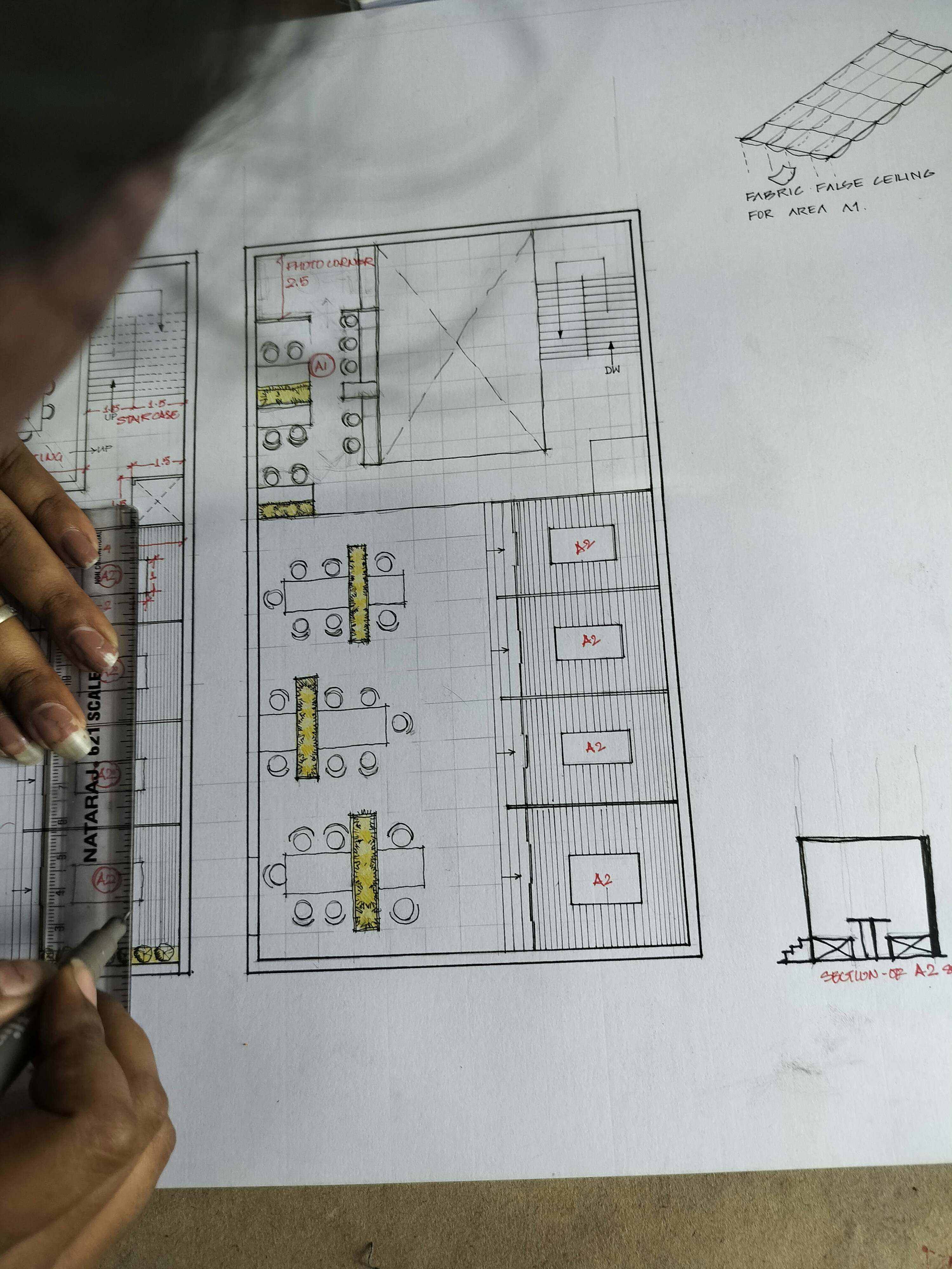
SECTION P–P | LEVEL: PLAN | HAND-DRAWN LAYOUT | REFERENCE IMAGE
LEVEL — FLOOR
01 / CIRCULATION
Draw the paths before the furniture
Circulation is how people move through a home: front door to kitchen, kitchen to table, bedroom to bathroom at night. Trace these routes over a plan first. If a main path cuts through the middle of the sitting area, or across the cook’s side of the kitchen, the layout will feel busy however well it’s furnished.
Good circulation keeps main routes along the edges of the busiest zones, lines up doorways where you can, and leaves thresholds clear. Watch the spots where doors, drawers and people all compete, like laundry doors opening into hallways or dishwashers opening across a walkway.
A quick test: walk the plan with a pencil for a normal weekday morning, then again for a dinner with guests. Any spot where the lines cross is worth a second look.
02 / ZONING
Group by activity, not by room name
A zone is a set of activities that belong together. Plan zones by noise, light and privacy, and let walls follow where they’re needed.
ACTIVE
Cooking, laundry, entry
These are hard-working spaces tied to plumbing and storage. Keep them close to where things come in and go out, such as the garage, the side path and the bins.
SOCIAL
Dining, living, outdoors
In Sydney, this zone usually wants the best light and a direct connection to the deck or garden, with the kitchen close enough to be part of it.
QUIET
Sleep, study, retreat
Buffer these rooms from the social zone with storage, a hallway or a bathroom. Don’t just rely on a single stud wall.
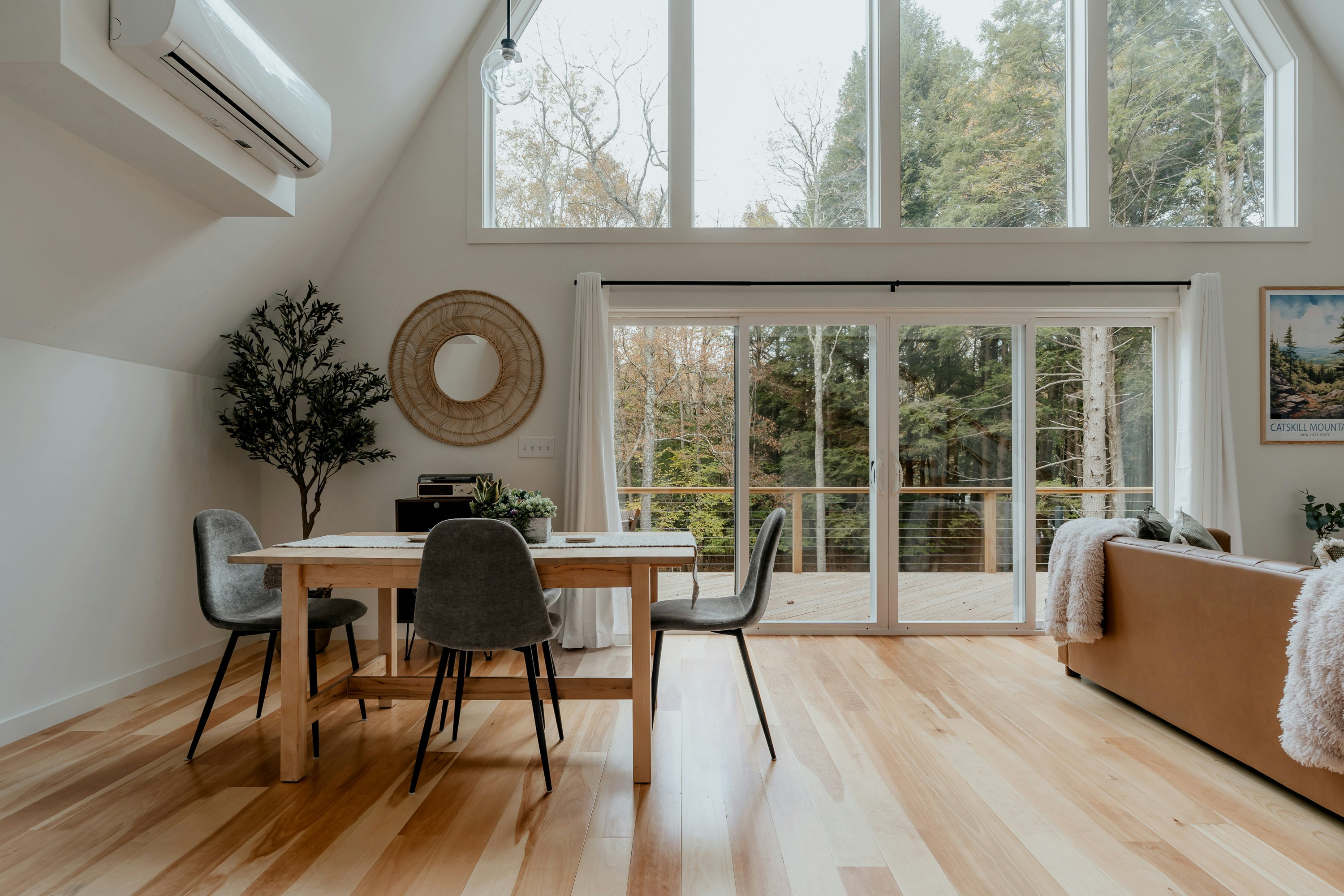
SECTION Q–Q | LEVEL: FLOOR | DINING TO LIVING | REFERENCE IMAGE
LEVEL — FLOOR · 03 / CLEARANCES
Leave room around the furniture
Clearances are the working space around a piece. They’re easy to lose on a plan, because furniture is drawn but people aren’t. Treat these principles as starting points, then check them against your actual pieces and the people who use them.
Dining
Leave enough space behind each chair to pull it out and sit down while someone walks past. A table that fits the room but not the chairs is too big.
Main walkways
A widely used rule of thumb is roughly 900mm for a primary path. Allow more where two people pass, or where a door or drawer swings into the route.
Seating groups
Keep sofas and chairs close enough for conversation, with a coffee table you can reach from a seat but still step around.
Beds and storage
Plan for wardrobe doors, drawers and bedside access together. In smaller rooms, sliding doors or custom joinery can give back floor space.
04 / OPEN PLAN
Open, broken or separate
Removing walls isn’t automatically an upgrade. Every option trades something away.
Fully open
You gain light, sightlines and a connection to the kitchen. You lose acoustic separation, a place to hide cooking smells and mess, and wall space for storage and art.
Broken plan
Changes in level, half-height joinery, sliding screens or a double-sided shelf define zones while keeping light moving. It often suits family homes best.
Separate rooms
Separate rooms give you quiet, privacy and more furnishable walls. The cost is borrowed light and a sense of flow, which can be a fair trade in a terrace or a home office.
LEVEL — NEXT
Test the plan before it's built
A layout is cheapest to change on paper. Our Space Planning service works through circulation, zones and furniture for your home. 3D Interior Visualisation lets you stand in the room before it’s built. If you’re working with a single floor plate, Apartment Interior Design applies these principles where every metre counts.
RELATED READING
Apartment Design Ideas for Small Sydney Spaces
Planning a Kitchen That Works
Home Renovation Ideas by Level
Have a question first? Send us a message.